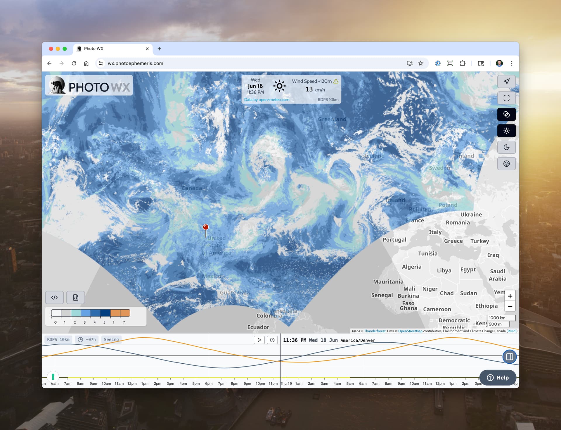
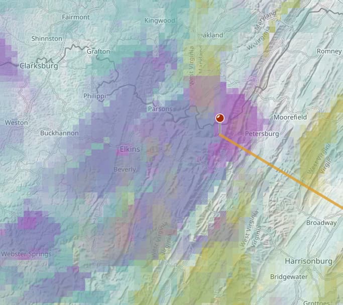
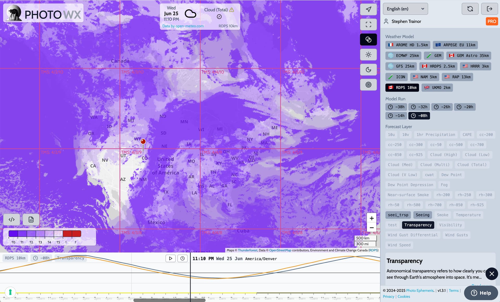
Some good news for all you night photographers out there: as Milky Way season gets underway in the northern hemisphere, for PRO users, we have today added a new 10km resolution Astronomical Seeing and Transparency forecast using Environment Canada’s RDPS model:
It’s a huge upgrade. Now, users in the UK, Ireland, Iceland, Scandanavia and a swathe of northern contintental Europe can access astronomy forecasts.
Thanks to Environment Canada for making this forecast available - they’re been on a tear the last few weeks with model updates and upgrades, and we’ll be adding more of models (HRDPS) and layers in the coming weeks.
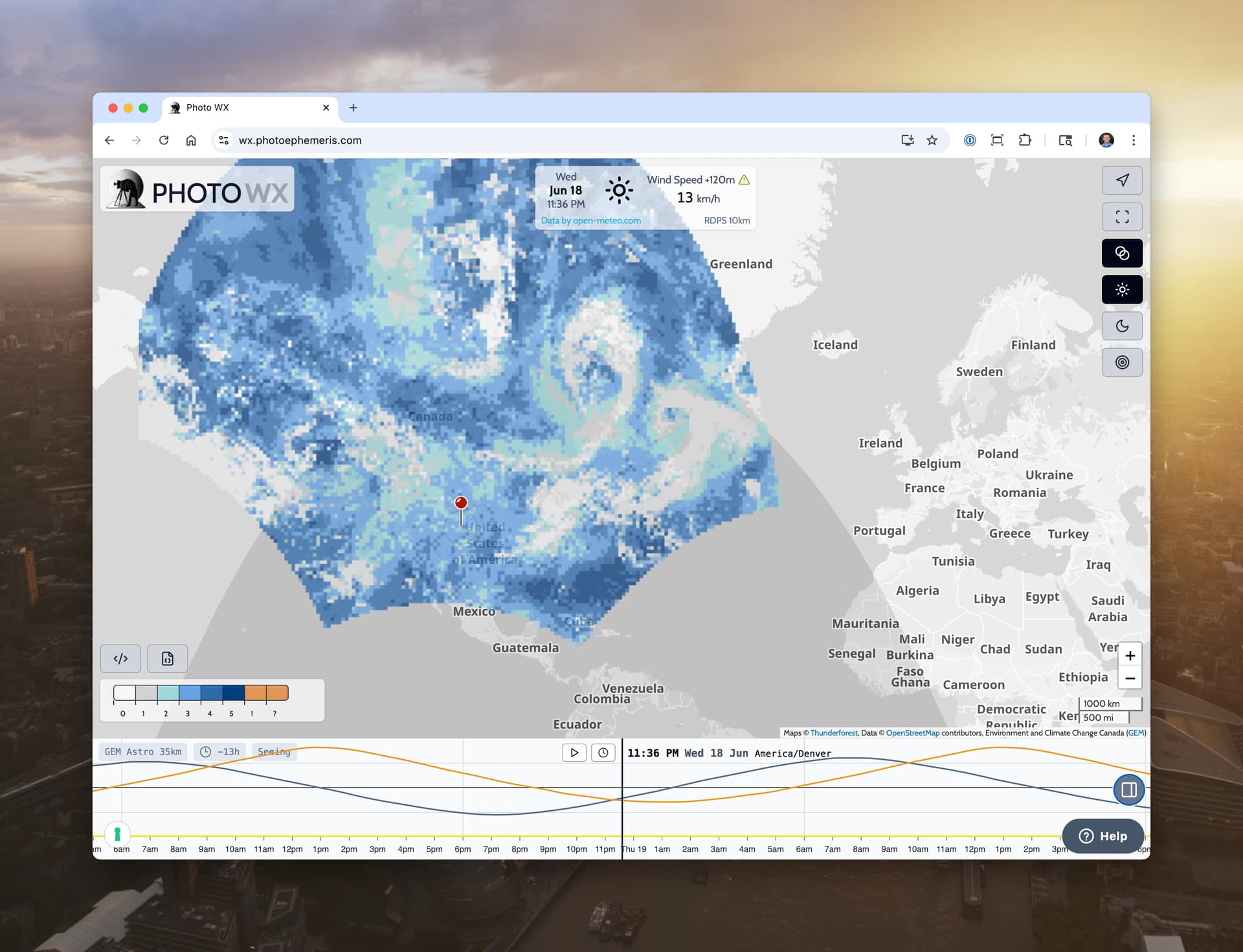
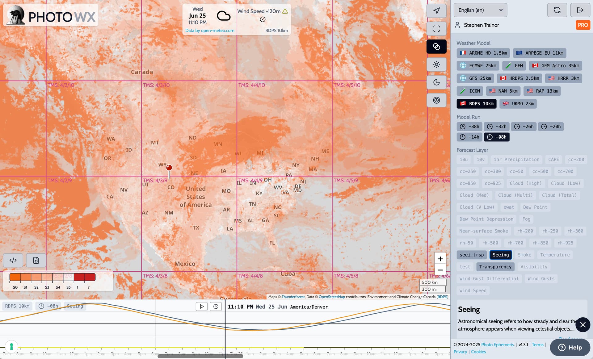
So I’m clear, this is showing the “quality” of the atmosphere, not the presence of cloud cover, correct? We would still want to consult the HRRR for the best read on presence of low, medium and high cloud cover, and if it is clear, consult the RDPS for the quality of seeing and transparency of that sky. Am I right?
Humidity is directly linked to cloud cover, so clouds are implicitly considered in the Transparency forecast. The two seem to me to be broadly correlated., but it would be interesting to observe and compare.
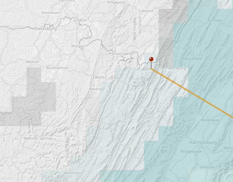
Here is the current HRRR multilayer clouds maps for my location. This seems accurate, as it is mostly cloudy with low cumulus and I can see scattered medium and high clouds in between the cumulus.
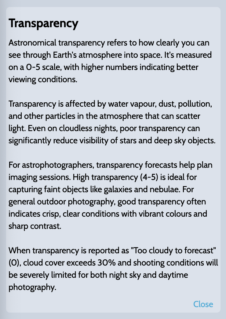
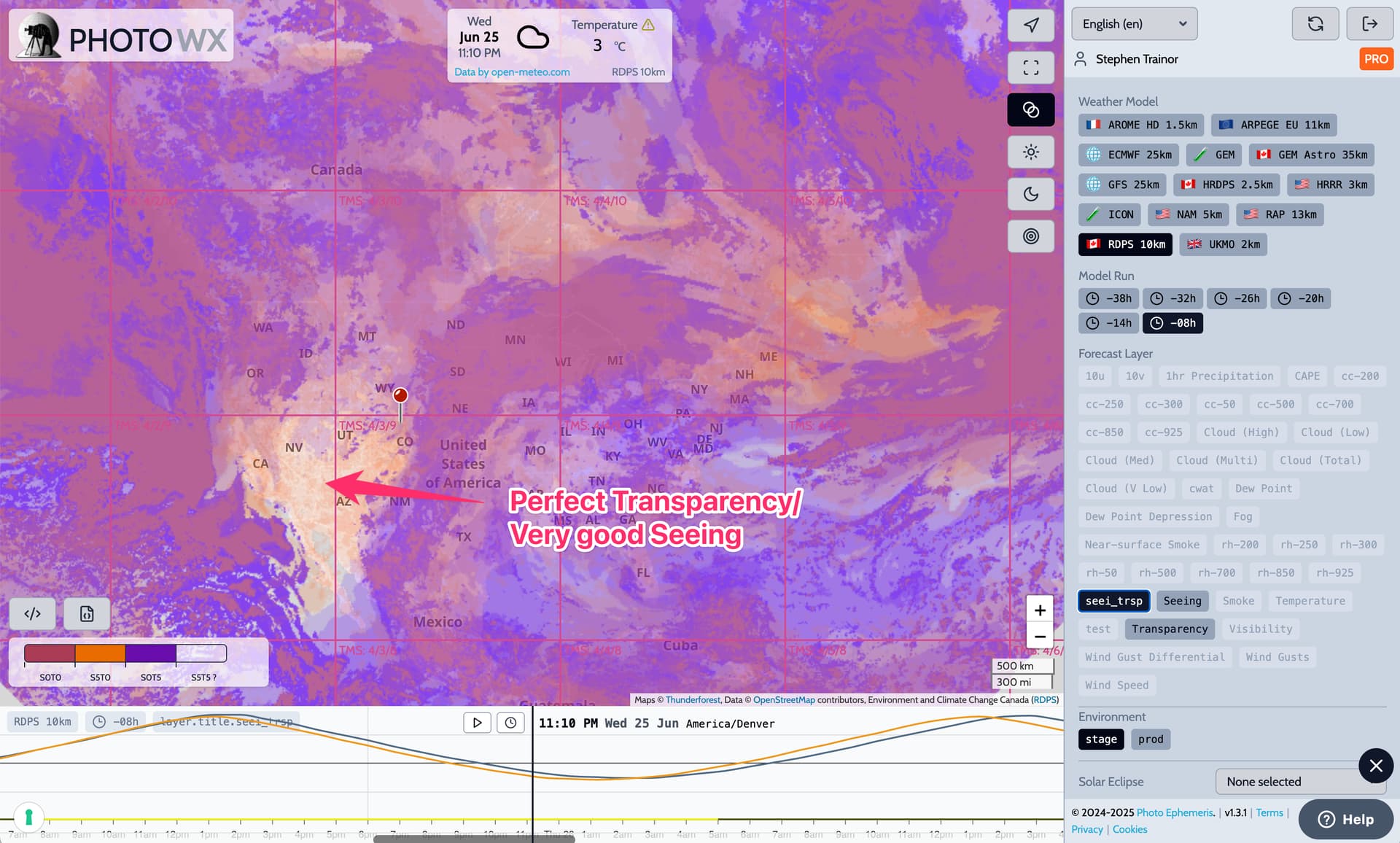
I would have assumed that the lighter (more transparent) colors would indicate better transparency. But now I see from the sidebar description that the opposite is true; zero (clear) to too cloudy, and 5 (dark blue) is ideal. So ideally we want transparent overlay colors on HRRR, and opaque colors for RDPS transparency!
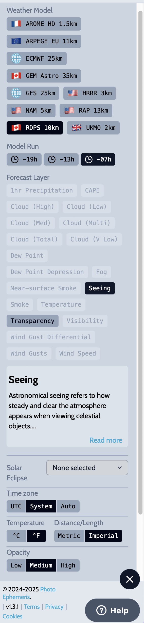
But what do the orange “!” and “7” on the legend scale mean?
The color legend was deliberately chosen to be the same as that used for many years now on ClearDarkSky.com, as that’s where most folks would be familiar with these forecasts from (although not in map form).
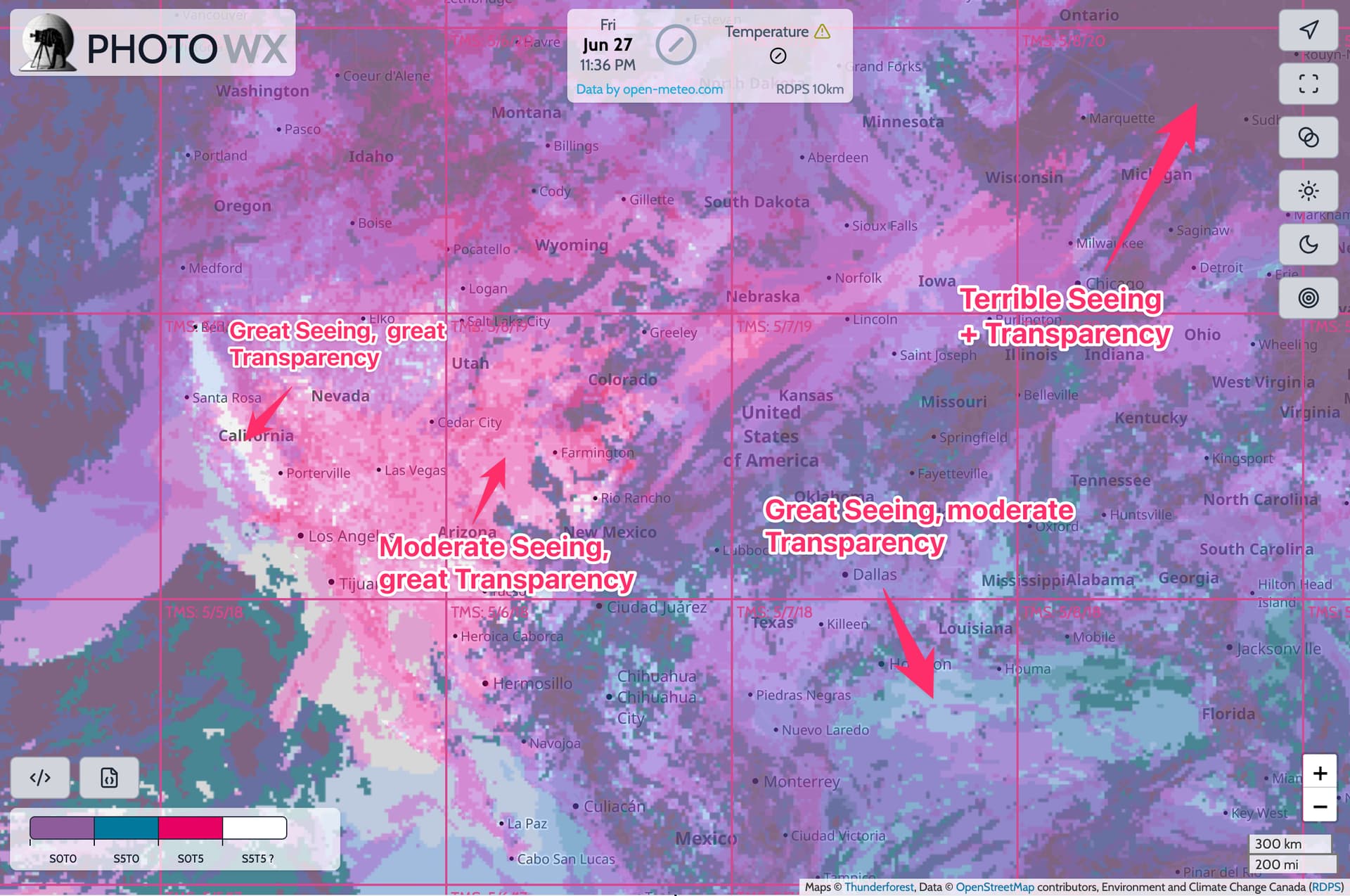
That said, I think it’s far from ideal also. There might well be an argument to change it for PhotoWX. As a first step, we’re working on a combined seeing + transparency custom layer so you can see clearly where there are good conditions for both. We’ll try a different color map approach for that, where clear actually means clear, rather than poor.
The orange “!” and “?” correspond to error or missing values in the source data. They’re documented in the original model, and we have to cover them in our color map. The color map legends are generated automatically from the source data rather than “hand crafted”, so occasionally there are some values that perhaps ideally wouldn’t be shown, but end up on display.
So ideally we want transparent overlay colors on HRRR
That’s what all the cloud layers do - clear color means no cloud. Is that what you meant?
Yes, clear (no color) for no clouds is most intuitive. I have seen some weather sites that use blue (as in the sky, I guess) to denote clear conditions, but I find that confusing and have to think about it, rather than just look!
I wish the Transparency overlay followed the same convention, but I understand you need to adhere to their specifications.
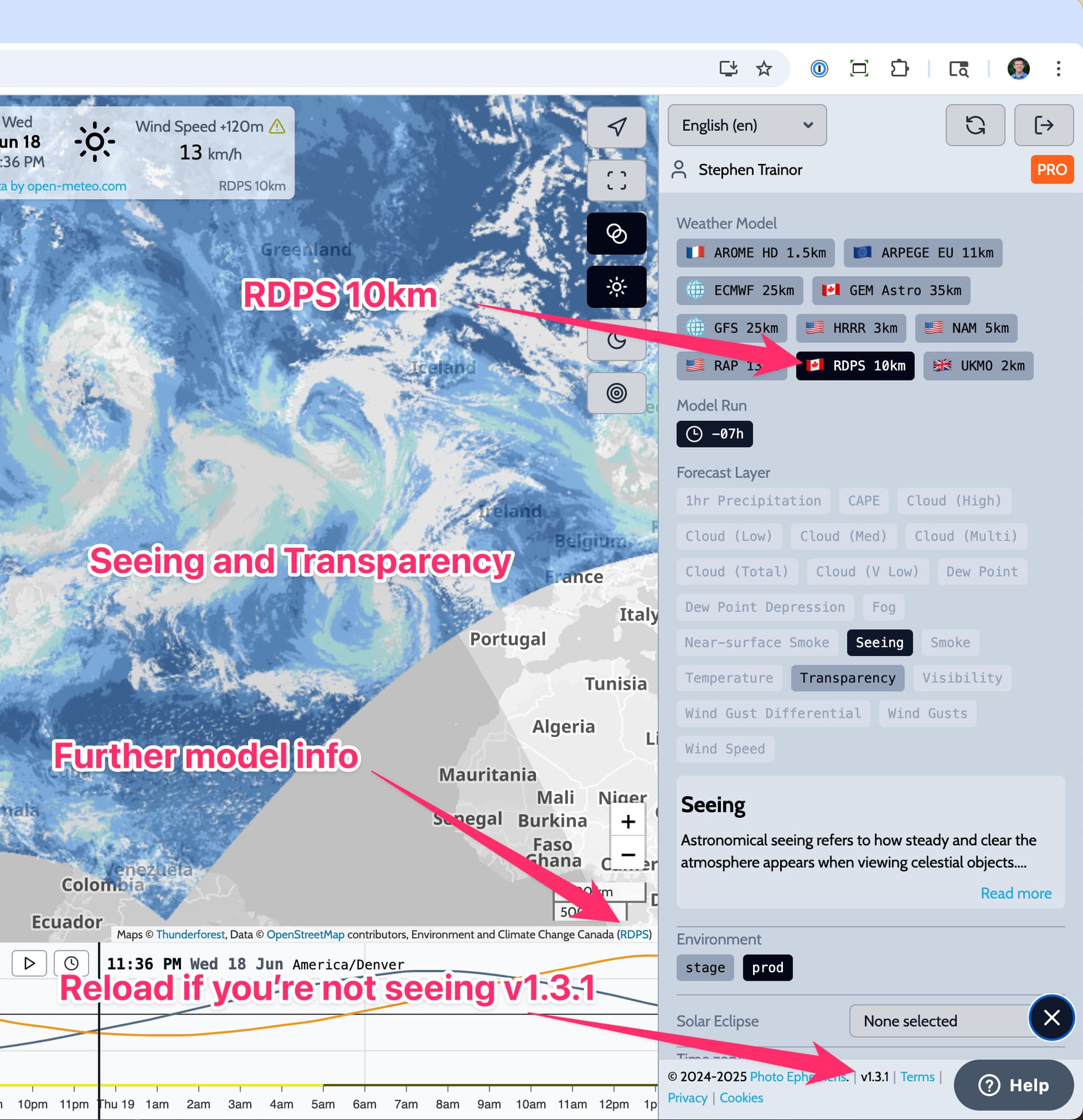
Hi Greg - do you mean the layer information like the Transparency example I pasted above? Just try reloading the page and maybe switching the selected layer - that should refresh it. Let me know if you’re still not seeing it!
Sorry, I realize now the arrow for “Further model info" is pointing to the link for RDPS. What I am referring to is not seeing the “Environment” section with options “stage” or “prod” that appear immediately above “Solar Eclipse”:
Ah - yes, the “stage and prod” stuff is actually an internal function for me and the Photo WX dev team! We have a parallel “staging” environment where all the weather forecasts are initially produced for testing purposes. You won’t see that in your view.
Thanks for the feedback on the combined seeing + transparency forecast - I’ll try to get that going this weekend.
I think this might be our release candidate colour scheme. Hopefully it all makes sense. If you can see clear areas on the map, then that’s great seeing and great transparency combined.